Design Elements
Imagery:
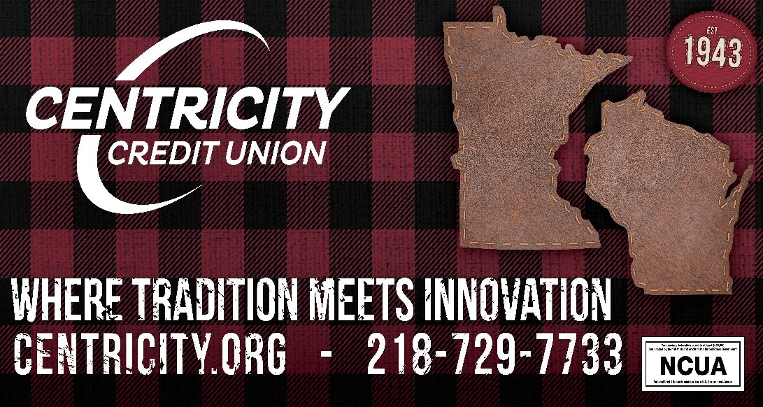
The red plaid shirt texture that serves as the billboard's background is more than just a visual touch; it's a deliberate nod to the quintessential northern Minnesota identity. Plaid, often associated with the rugged outdoors and warmth, conjures images of the classic lumberjack shirt—a symbol deeply embedded in the local culture and heritage. This familiar pattern evokes feelings of comfort and reliability, resonating with the community's spirit and the credit union's approachable nature.
Choosing this texture emphasizes Centricity Credit Union's integration into the fabric of everyday life in Minnesota. It suggests a shared history and common values, reinforcing the message that the credit union is a longstanding part of the local landscape, as comforting and reliable as the pattern itself.
The leather-textured patches in the shapes of Minnesota and Wisconsin and the "Est. 1943" patch add to this narrative. Their resilience and timeless quality echo the credit union's own robustness and commitment to growth and service throughout the years. The stitching represents the connections within the community, much like the interwoven threads of a fabric, symbolizing unity and the strength of relationships built over time.
Combined, the red plaid and the leather elements create a rich tapestry that speaks to the heart of the credit union's identity—a blending of tradition and trust with a promise of ongoing innovation and support for every member. The overall design captures Centricity Credit Union's dedication to their roots while dynamically moving forward with the community they serve.