CENTRICITY CREDIT UNION FOUNDATION
Event Campaign Design
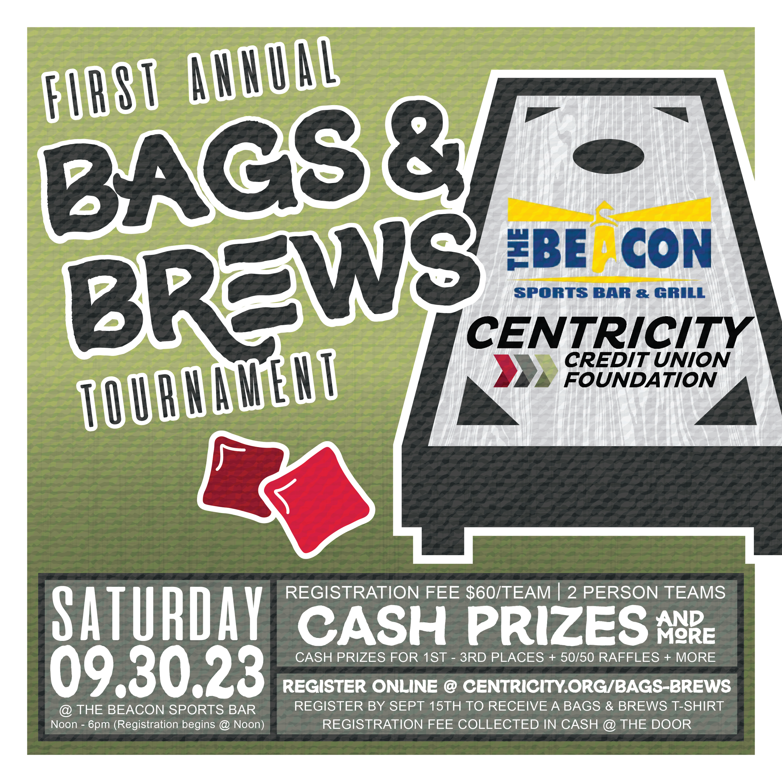
The campaign design is vibrant and attention-grabbing, utilizing a dynamic layout, with various elements like text and logos oriented in different directions to create visual interest.
Overall, the design is balanced yet energetic, effectively communicating the fun and competitive nature of the event while also providing all the necessary details in a clear and structured format.

Design Elements
Typography:
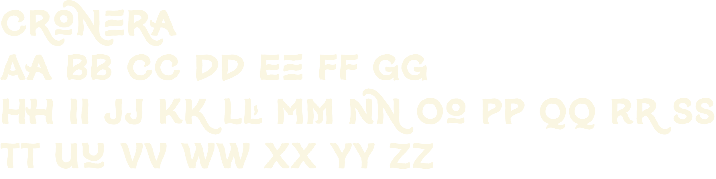
The three fonts used in this campaign are distinct in their character and serve different design purposes:
Aliens and Cows: This font presents a bold and somewhat irregular appearance, with each character seeming to be crafted with a slightly distressed and stencil-like design. The irregularity in the strokes and the incomplete parts give it an edgy, dynamic feel that is well-suited for attention-grabbing headlines or statements meant to stand out.
Cronónera: With its varying line thickness and a rough, brush-stroke style, this font has a casual and somewhat rustic appeal. It conveys a sense of individuality and human touch, perfect for projects that aim for an artisanal or personal vibe. It's great for use in contexts where a touch of personality and informality is needed.
Circular TT-Book: This is a sans-serif font with clean, modern lines, and uniform weight throughout. Its clarity and simplicity make it an excellent choice for body text where readability is key, or for conveying a sleek, contemporary look in titles and headers. It provides a nice visual balance to more decorative or expressive fonts and works well in a wide range of design applications.


Color Palette:
The color palette presented includes four colors ranging from light to dark shades. Together, this palette could suggest a theme of reliability and nature-inspired stability, possibly for eco-friendly or outdoor products, and could be associated with a brand that values tradition and quality. The palette is balanced, with enough contrast between the colors to create a visually pleasing hierarchy in design elements.

THE OUTCOME