LAKE EFFECT PHOTOGRAPHY
Logo Design
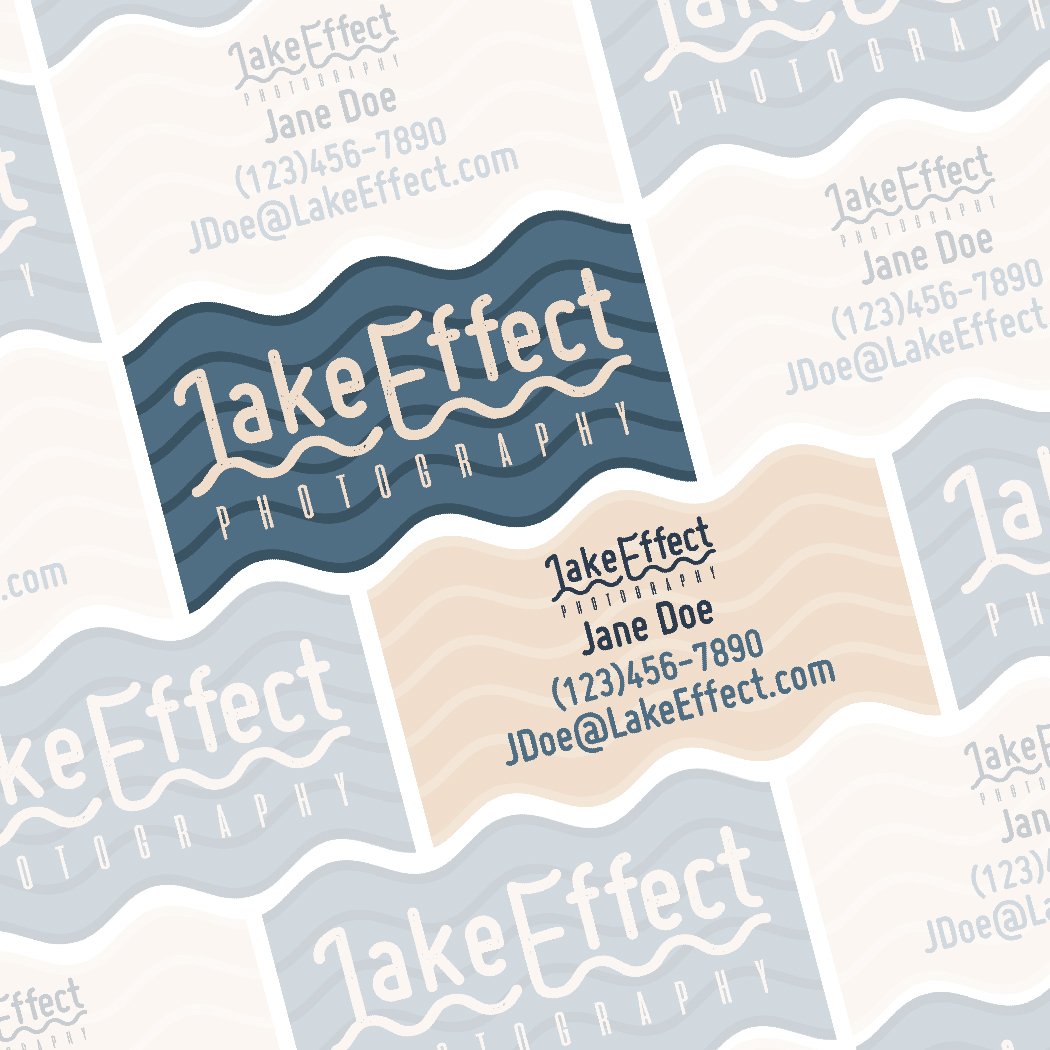
The logo for Lake Effect Photography encapsulates the serene and dynamic essence of Northern Minnesota's natural landscapes. Designed to mirror the tranquility of lakeside visuals, the logo combines natural shapes with modern typography to represent the brand's focus on capturing the beauty of life by the lake.
Design Elements:
Typography:
The logo of Lake Effect Photography harnesses the unique characteristics of two distinct typefaces: 'Miso Bold' and 'Aliens and Cows'.
“Miso Bold', with its clean, sans-serif appearance, lends a modern and minimalist charm to the design. Its boldness ensures legibility, making it an excellent choice for brand name recognition. The use of texture gives the typeface an element of rustic charm, bridging the gap between the brand's contemporary edge and its connection to the natural world.
On the other hand, 'Aliens and Cows', a typeface with a playful and futuristic feel, contrasts the straightforwardness of 'Miso Bold'. It provides an edgy counterpoint, suggesting that Lake Effect Photography embraces innovation and creativity. The quirky character shapes and the stencil-like cuts of 'Aliens and Cows' typeface offer a visual twist that keeps the viewer's interest and hints at the brand's unique perspective in capturing photographic narratives.
The pairing of these two typefaces in the logo allows for a versatile identity system. The logo can adapt across various platforms while maintaining a cohesive brand image that speaks to the brand's dynamic approach to photography: grounded in nature but with a keen eye on the contemporary and the unconventional.


Imagery:
Echoing the ripples of a lake’s surface, the wavy line beneath the text symbolizes the constant motion and gentle flow of water, core characteristics of the lakes in Northern Minnesota. The line's fluidity adds a sense of calmness and connectivity to the design.

Color:
The use of a white color for the text ensures high contrast and visibility. The blue hues represent both the literal lakes that are central to the brand’s location and the clarity and depth that they aim to bring to their clients' memories.

THE OUTCOME
The new logo for Lake Effect Photography is now synonymous with the brand. It stands as a testament to the power of thoughtful design, harmoniously blending modern aesthetics with organic nuances to capture the brand's unique identity.
The logo has not only strengthened Lake Effect Photography's brand identity but has also propelled its market position, enhancing its visibility and fostering a deeper connection with its audience. Through this logo, Lake Effect Photography has successfully encapsulated its vision, creating a lasting impression that is as enduring as the moments they capture.