PASTA AMORE WEB DESIGN

Pasta Amore Site Map:

The sitemap for Pasta Amore shows the user-centric approach to the website’s navigation, reflecting an understanding of the needs and behaviors of restaurant goers. The structure is designed to offer intuitive pathways to essential information, with a clear hierarchy that guides users fluidly from general to specific.

Each node in the visual sitemap mirrors the user's thought process, with anticipatory design elements that address the user’s next potential question or action. The sitemap is a reflection of the restaurant’s commitment to exceptional user experience, both online and at the table.

The sitemap is an artifact showcasing my ability to translate brand identity into a navigable, delightful digital experience, and serves as a precursor to the thoughtful design that patrons can expect when they step through the doors of Pasta Amore.

WIREFRAME WALK THROUGH

Wireframes are a foundational tool in the user experience (UX) design process. They serve as a low-fidelity blueprint for a digital product, such as a website or an app. Here's a concise overview of their purpose:

Structure and Layout Definition: Wireframes outline the basic structure and layout of the pages without the distraction of design elements like colors or images. They focus on the placement of elements and the functionality of the page.

Hierarchy and Clarity: They establish a clear hierarchy of information, helping designers prioritize content and features according to user needs.

Navigation Planning: Wireframes facilitate the planning of navigation pathways, ensuring that users can find what they're looking for with ease.

Collaboration and Communication: They act as a communication tool between designers, developers, stakeholders, and clients, making it easier to discuss and refine the product concept before any heavy design or development work begins.

Efficiency and Cost-Effectiveness: By addressing and resolving usability issues early in the design process, wireframes can make the process more efficient and help avoid costly changes during the development phase.

The wireframe presented for Pasta Amore serves as a blueprint for the website's design, emphasizing usability and the overall user journey. This section showcases the careful planning of the website’s skeleton, focusing on space allocation, content prioritization, and user flow.

This wireframe reflects a keen understanding of hierarchy, simplicity, and the brand’s personality. The design is not just about creating a path; it’s about crafting an experience that feels as organic and welcoming as the restaurant itself. By focusing on the user’s needs and the brand’s core values, this wireframe lays the groundwork for a seamless and satisfying online interaction with Pasta Amore.

The wireframe is a testament to the thoughtful orchestration of content, design elements, and user needs—forming a harmonious symphony that speaks to the very essence of user experience design.

DESIGN ELEMENTS

LOGO DESIGN & BRAND MARK:

The Pasta Amore logo design presents a blend of classic and whimsical elements to convey the brand’s identity. The logo features the name "PASTA AMORE" in bold, capital letters that alternate between a rich red and a deep green, reflecting the colors of the Italian flag and emphasizing the restaurant's Italian cuisine.

The typography used is strong and clear, with a traditional serif font that adds a sense of formality and heritage. This suggests a connection to time-honored Italian cooking methods and recipes passed down through generations.

Incorporated into the logo is a graphic element of a tomato, designed to form the shape of a heart at the center. This creative touch not only visually represents the word "amore," which means love in Italian, but also symbolizes the restaurant’s passion for Italian food, as well as the fresh, natural ingredients that are at the heart of their dishes.


TYPOGRAPHY:

Klinic Slab Book is a versatile slab serif typeface that strikes a balance between a modern and classic aesthetic. The slab serifs are noticeable but not overwhelming, giving the font a stable and sturdy feel, which is often associated with reliability and professionalism. This typeface's variety in weight and form allows for a broad range of expression, from the elegance and refinement needed for high-end branding to the clarity and straightforwardness required for informative web content.

In the context of a website, Klinic Slab Book serves well for both user interface elements and content hierarchy. Its legibility at various sizes ensures that the typeface is functional across different devices and resolutions. The selection of this typeface suggests a brand identity that values tradition yet embraces a modern touch, a fitting choice for establishments like restaurants that want to present themselves as both reputable and contemporary.


COLOR PALETTE:

The color palette for the website is rich and evocative, drawing inspiration from a theme that suggests culinary richness and rustic elegance. With deep reds, earthy browns, and a vibrant green, it captures the essence of traditional Italian dining through a visual language.

As a whole, this palette can create an inviting and coherent user experience. It's versatile enough to allow for clear information hierarchy on the website while also contributing to the overall storytelling of an Italian culinary experience. The interplay between the colors can help direct user navigation and emphasize the brand's identity.


VISUAL ELEMENTS:

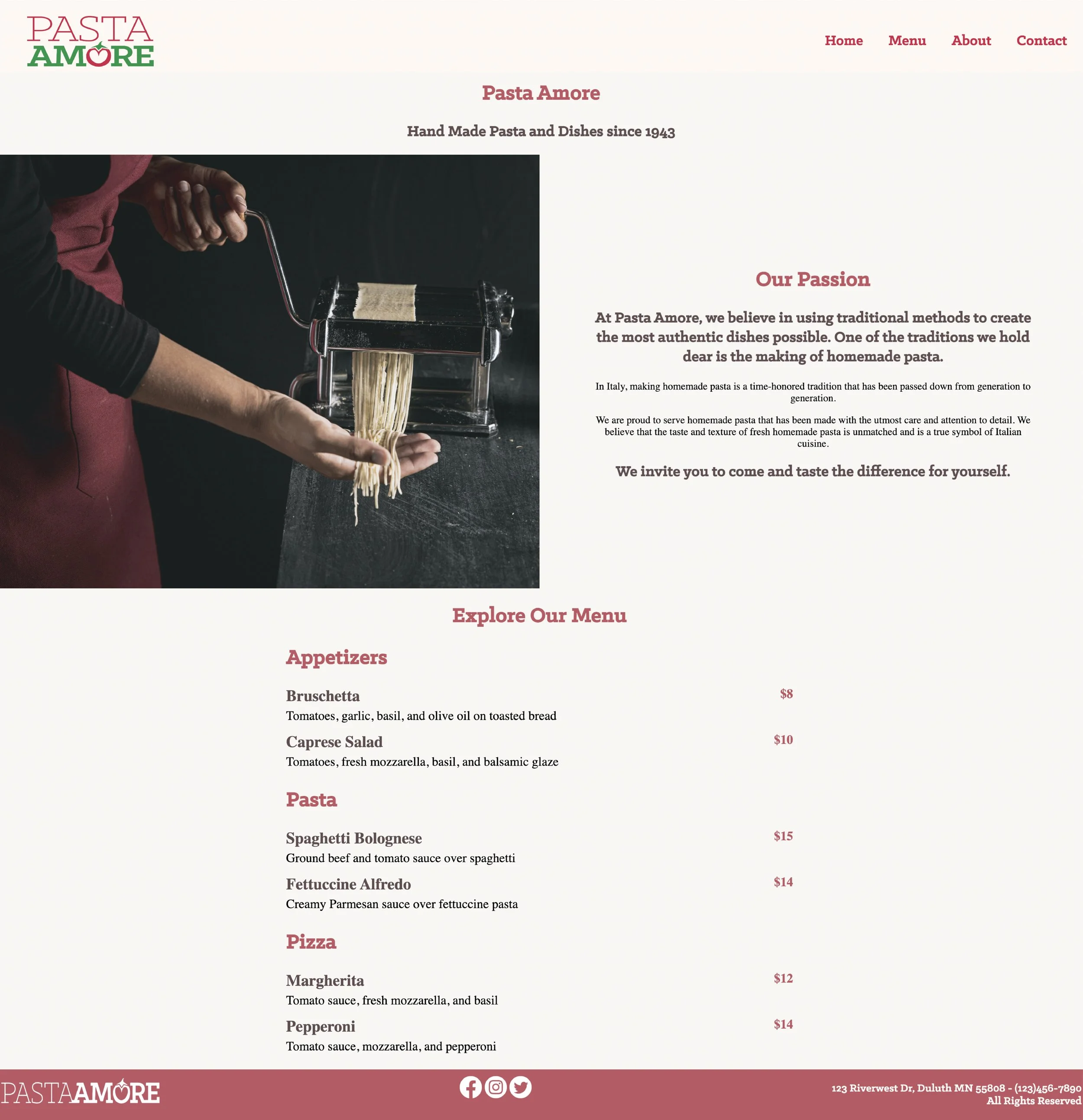
The visual elements on the website celebrate the art of Italian cooking and dining that give a sense of craftsmanship and homemade quality that is often associated with a good dining experience.

Together, these elements tell a story of the dining experience from preparation to presentation. They suggest a hands-on, meticulous approach to food that's both traditional and creative, aiming to entice the viewer with the promise of a gourmet experience. The imagery is likely intended to appeal to the viewer’s senses and create an association with high-quality, artisanal food preparation and enjoyment.

THE FINAL DESIGN

Home Page

Menu Page

About Page

Contact Page

LIKE WHAT YOU SEE?

Lets Work Together!